- Connect (AM 1.0) Documentation
- Product and System Information
- Product Updates and Announcements
- Announcement: Destination Account Pages have a New Look, Feel, and Navigation (10/7/21)
Announcement: Destination Account Pages have a New Look, Feel, and Navigation (10/7/21)
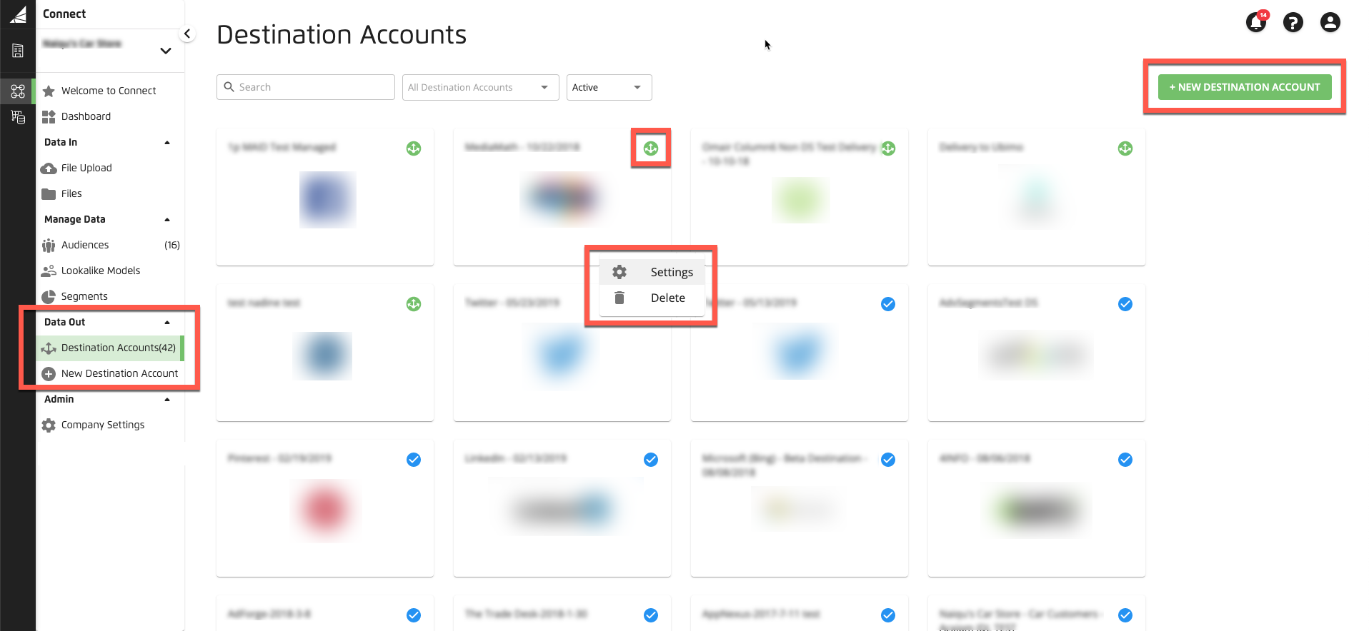
We’ve released changes to the destination account pages in Connect to give them a new look and feel (we’ve also made adjustments to the navigation menu for these pages). These changes will also provide more efficient workflows, and improve navigation and usability.

The changes we released include:
The look and feel of all destination account pages has been brought up to date
The previous method used to activate a new destination account (with a tile) has been replaced with a clearer button
The destination account status icons have been updated to be clearer
The name of the main page has been changed from “Your Destination Accounts” to “Destination Accounts”
Some items in the left-hand navigation menu have been revised:
“Active Destinations” has been changed to “Destination Accounts” (but still shows active destinations by default)
A new menu item “New Destination Account” has been added to make it easier to go straight to destination account activation
“All Destinations” has been removed
For destination accounts with longer names, a tooltip now appears giving the full name
The destination account card action menu (for editing or deleting DAs) now includes text descriptions