Data Preparation Trends Dashboard
The Data Preparation Trends dashboard provides insights into data preparation trends over time. It lets you view and analyze several key metrics related to data preparation. These metrics can help you optimize your identity graph by improving the efficiency and quality of data preparation processes in your workflow.
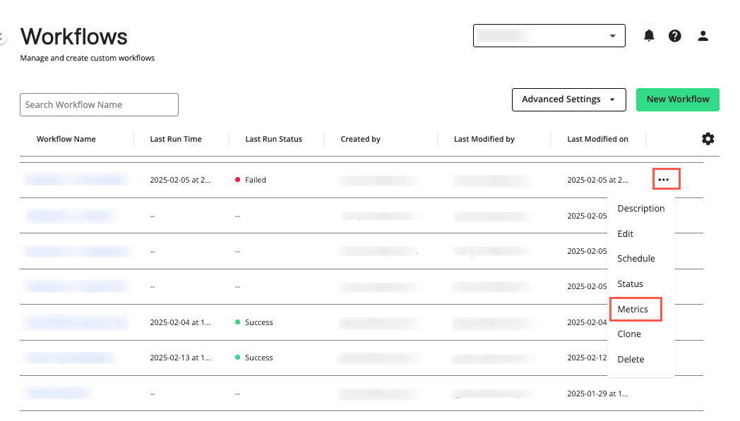
On the Workflows page, click the More Options menu (
 ) of the workflow you want to review and select .
Note
The “Metrics” option is unavailable for workflows that have not yet been run successfully.
The Graph Build Overview dashboard displays.
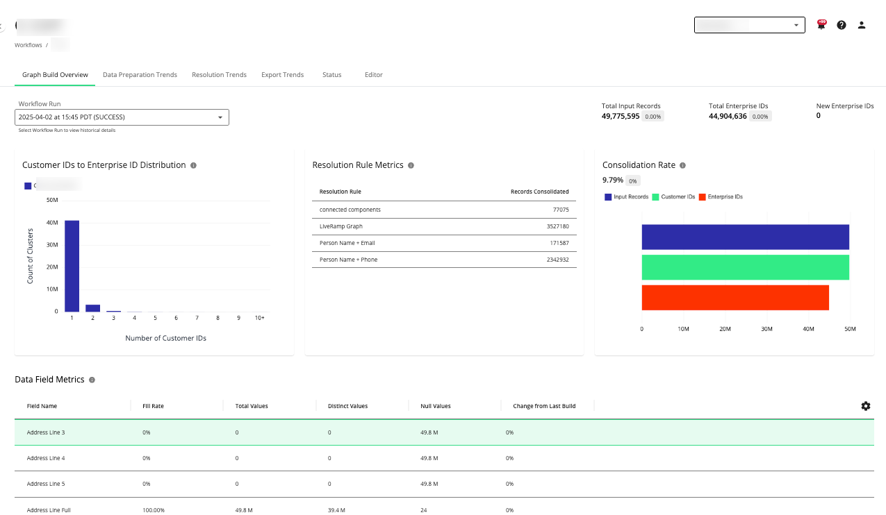
On the Graph Build Overview dashboard, select the tab.
The Data Preparation Trends dashboard displays.
Actions You Can Perform on the Data Preparation Trends Dashboard
You can perform the following actions on the Data Preparation Trends dashboard page:
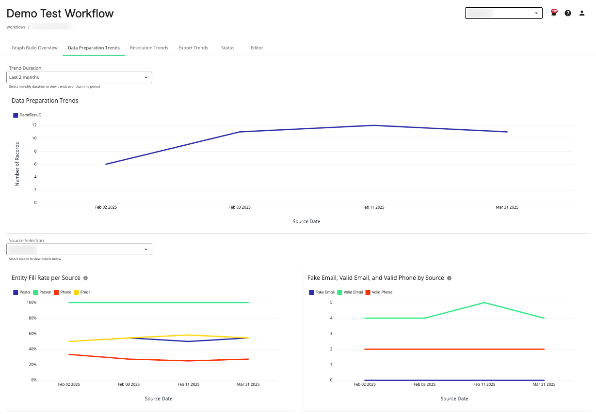
View metrics for trends in data preparation, entity fill rate per source, and fake email, valid email, and valid phone by source.
Adjust the time period in which to view the data preparation trends by selecting the number of months in the dropdown list.
Navigate to the Graph Build Overview, Resolution Trends, or Export Trends dashboards by selecting the desired tab.
View the workflow status by selecting the tab.
Edit the workflow by selecting the tab.
Data Preparation Trend Metrics
The following metrics are available on the Data Preparation Trends dashboard:
Note
Hover over the source data within a chart to display more details. To show or hide sources, click the corresponding source icons located at the top of each chart.
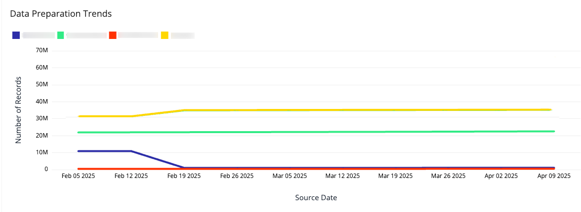
Data Preparation Trends
The “Data Preparation Trends” chart displays trends in the number of records by source prepared over time. This can be useful to not only see trends in data preparation from one source, but compare the trends of different sources in your workflows. Typically, data preparation trends should remain fairly steady, with slight changes corresponding to increases or decreases in data sources over time.
Note
To adjust the trend duration, select the number of previous months from the dropdown list. You can select monthly intervals from the last 2 to 6 months.
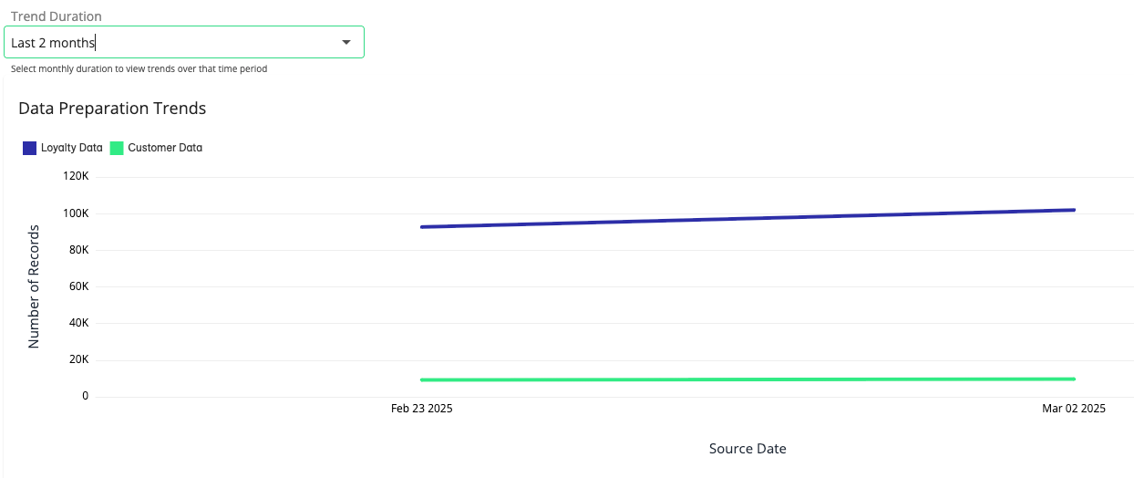
These trends can be helpful for comparing the relative sizes of different data sources (e.g., B2B, customer data, or loyalty programs) or seeing the growth of data input over time.
Entity Fill Rate per Source
The “Entity Fill Rate per Source” chart displays the fill rate of the mapped entities for each source. This can be useful to help you identify changes in fill rate that might indicate issues with your source data.
Note
Use the dropdown list to select the data source.
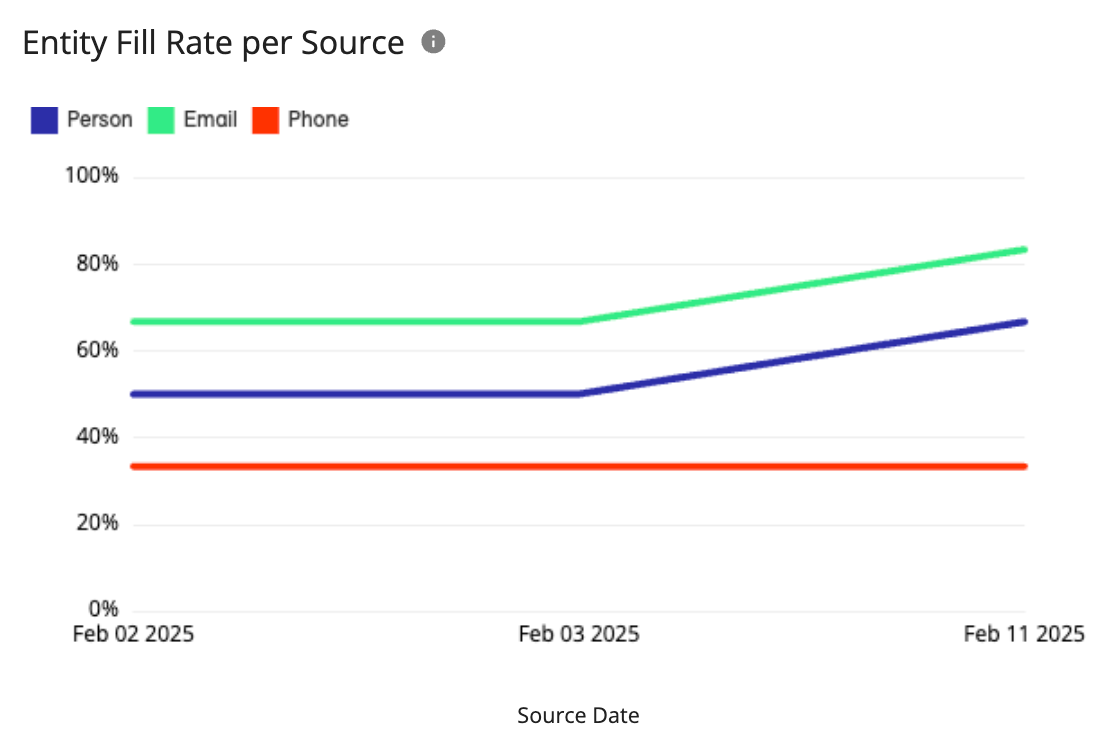
Drastic or unexpected changes in entity fill rates could indicate a misconfiguration in your data preparation processes or changes to the file formats you’re using as your data source.
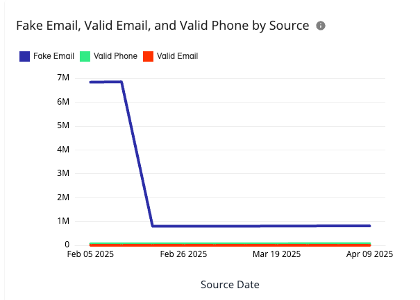
Fake Email, Valid Email, and Valid Phone by Source
The “Fake Email, Valid Email, and Valid Phone by Source” chart displays the number of fake emails, valid emails, and valid phone numbers in your source data. This can be helpful to let you know the quality of your data sources so you can improve match rates. Records are rejected if they don’t contain matchable data, so this is an important metric to help guide you in your data preparation.
Note
Use the dropdown list to select the data source.
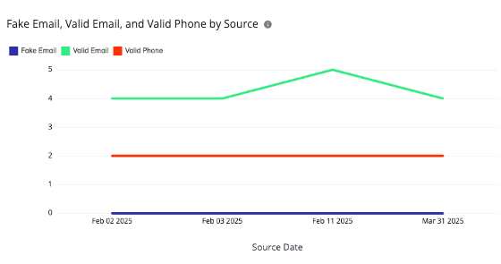
A large number of fake emails or invalid phone numbers could indicate problems in the quality of the data source or the use of placeholder values (e.g., “noreply@email.com”, “111-111-1111”, etc.).