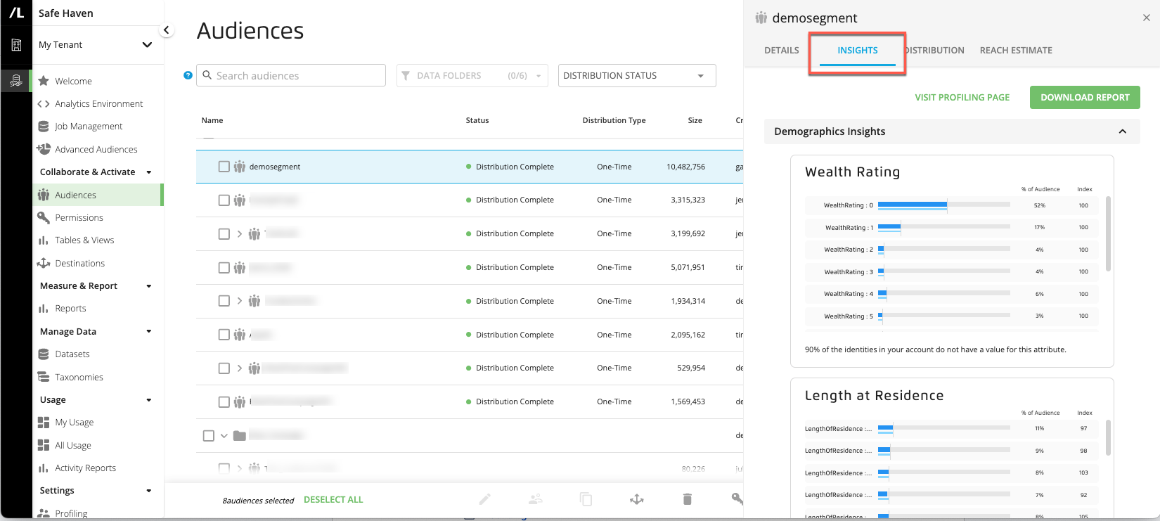
View Audience Insights
You can view demographic and audience visualizations for a particular audience when you select the Insights tab on:
The side panel for an audience selected from the "Saved Audiences" folder on the Audiences page.
You can also click to download the report data in XLSX format.
Caution
Any permissioned data in the built audience must be permissioned with the "Build Insights visualizations using this data" use case.
The demographic and audience visualizations that are displayed for a particular audience on the Audience Builder page are determined by the active insights profile for your account. See the "Profiles" section of this documentation site for more information.
There are two types of insights available, depending on the types of visualizations in the active profile:
Audience insights: Compares the selected segment values in the built audience to those values in other specific audience data in your account (the "base" audience). This can be either data you own or partner data that has been permissioned to you with the "Build Insights visualizations using this data" use case.
Demographic insights: Compares the selected segment values in the built audience to those values in your entire Safe Haven account identity space. For demographic insights, the "base" audience is your account identity space.
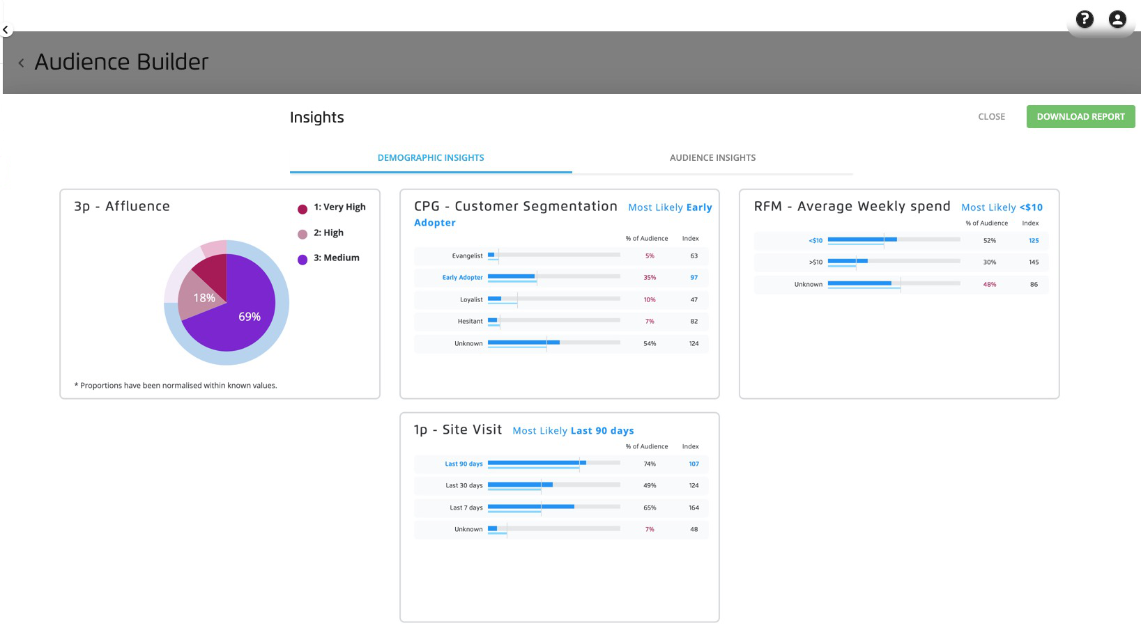
Use the DEMOGRAPHIC INSIGHTS and AUDIENCE INSIGHTS tabs at the top of the page, which are displayed if the active profile contains both audience insights and demographic insights.
You can use audience insights to learn more about how the audiences you are building compared to another audience of interest (the "base" audience). You can see this comparison through a visualization or an index calculation to understand how your audience is unique.
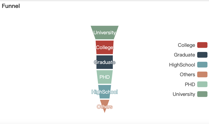
Audience Insights can include the following chart types:
Pie
Bar
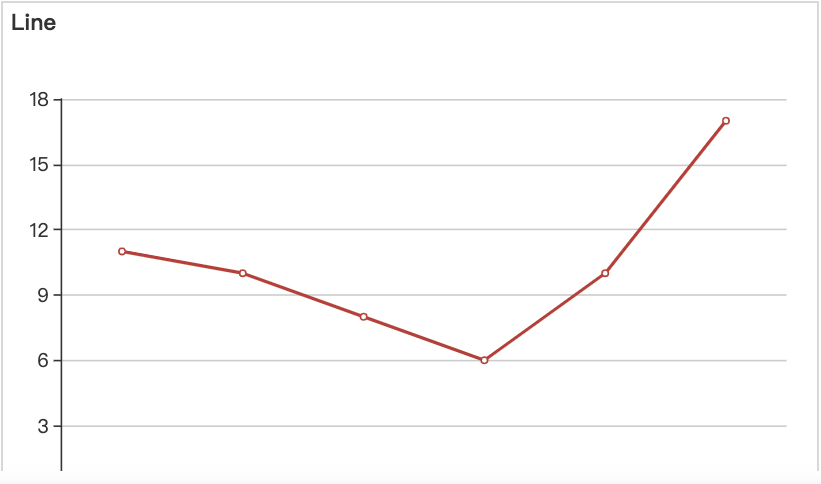
Line
Funnel
Pie-index
Bar-index
Note
See the sections below for information on pie, pie-index, bar, and bar-index charts
Insights that provide a comparison to a base audience can give you information on what you should target and what creative or communication strategy to apply, as well as guidance on how to interpret your built audience’s overlap with an insight’s audience.
Caution
Any permissioned data in the built audience must be permissioned with the "Build Insights visualizations using this data" use case.
Interpreting Audience Insights Pie Graphs
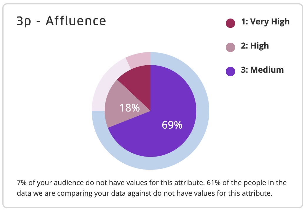
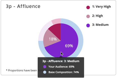
The audience insights pie graph compares the percentage of your built audience that falls into each of the selected segment values to the percentage of your base audience that falls into each of those values. Each segment value is given a distinct color according to the legend provided.
Note
The segment values are selected when you edit the active profile. See "Edit a Profile" for more information.
The inner pie area shows (in darker colors) the percentage of your built audience that falls into each of the segment values.
The outer pie area shows (in lighter colors) the percentage of your base audience that fall into each of the segment values.
At the bottom of each graph, we indicate what percentage of your built audience members do not fall into any of the selected segment values (do not have any values for this attribute).
We also indicate what percentage of the people in the data we're comparing your data against do not fall into any of the selected values.
Hover over an area of the chart to see the exact percentages for each value.
Interpreting Audience Insights Bar Graphs
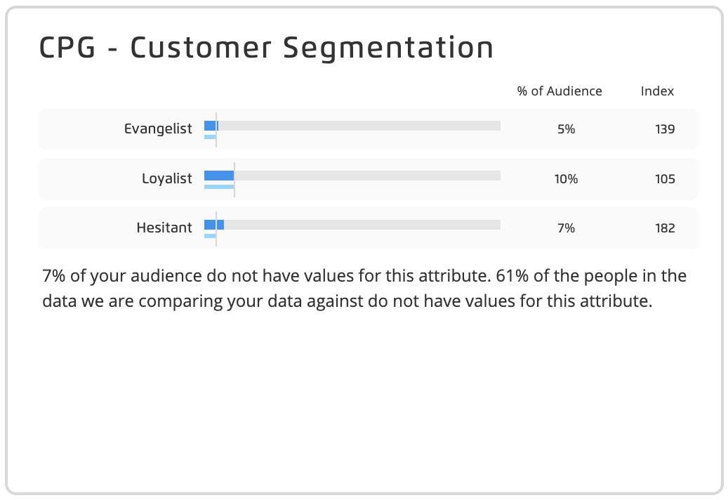
The audience insights bar graph compares the percentage of your built audience that falls into each of the selected segment values to the percentage of the base audience that falls into each of those values. Each segment value is given a row in the bar graph.
Note
The segment values are selected when you edit the active profile. See "Edit a Profile" for more information.
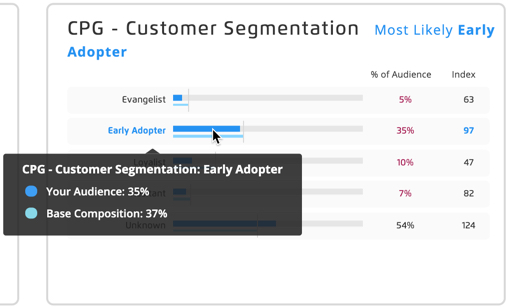
The dark blue bar represents the percentage of your audience that falls in that segment value.
The light blue bar represents the percentage of the base audience that falls in that segment value.
The % of Audience column displays the exact percentage of your audience that falls in that segment value.
The Index column displays if the "bar-index" chart type was selected and shows the index value, which represents the percentage of your built audience with that segment value divided by the percentage of the base audience with that segment value times 100 (Audience%/Base composition%*100). An index of between 80 and 120 means that the two percentages are not significantly over indexed or under indexed. A value over 120 indicates that your built audience is "over indexed" or more represented in your built audience than in your base audience. A value under 80 indicates that your built audience is "under indexed" or less represented in your built audience than in your base audience.
At the bottom of each graph, we indicate what percentage of your built audience members do not fall into any of the selected segment values (do not have any values for this attribute).
We also indicate what percentage of the people in the data we're comparing your data against do not fall into any of the selected values.
Hover over a category to see the exact percentages for each value.
You can use demographic insights to learn more about the audiences you are building compared with the attributes of your entire Safe Haven account identity space. You can see this comparison through a visualization and index calculation to understand how your audience is unique.
Demographic Insights can include the following chart types:
Pie
Bar
Insights that provide a comparison to your account identity space can give you information on who you should target and what creative or communication strategy to apply, as well as guidance on how to interpret your built audience’s overlap with your identity space.
Interpreting Demographic Insights Pie Charts
The audience insights pie graph compares the percentage of your built audience that falls into each of the selected segment values to the percentage of your account identity space that falls into each of those values. Each segment value is given a distinct color according to the legend provided.
Note
The segment values are selected when you edit the active profile. See "Edit a Profile" for more information.
The inner pie area shows (in darker colors) the percentage of your built audience that falls into each of the segment values.
The outer pie area shows (in lighter colors) the percentage of your account identity space that fall into each of the segment values, according to the data used to build the demographic insight (the reference dataset).
At the bottom of each graph, we indicate the percentage of your built audience members and general population dataset members who don't fall into any of the selected segment values (don't have any values for this attribute).
Hover over an area of the chart to see the exact percentages for each value.
Interpreting Demographic Insights Bar Graphs
The demographic insights bar graph compares the percentage of your built audience that falls into each of the selected segment values to the percentage of your account identity space that falls into each of those values. Each segment value is given a row in the bar graph.
Note
The segment values are selected when you edit the active profile. See "Edit a Profile" for more information.
The dark blue bar represents the percentage of your audience that falls in that segment value.
The light blue bar represents the percentage of your account identity space that falls in that segment value (according to the data used to build the demographic insight).
The % of Audience column displays the exact percentage of your audience that falls in that segment value.
The Index column displays the index value, which represents the percentage of your built audience with that segment value divided by the percentage of your account identity space with that segment value times 100 (Audience%/AccountIdentitySpace%*100). An index of 100 means that the two percentages are equal. Values over 100 indicate that your built audience is "over-indexed" or more represented in your built audience than in your overall account identity space.
At the bottom of each graph, we indicate what percentage of your built audience members and your account identity space members do not fall into any of the selected segment values (don't have any values for this attribute).
Hover over a category to see the exact percentages for each value.